
TUNE Experience Language
Setting the standards for design and consistency across products and designers.
TUNE, 2015 - Present
BUSINESS GOAL
TXL was a combined goal of the design and engineering teams at TUNE. We all wanted to work efficiently to create a system of patterns and components that could be reused across products.
PROBLEMS
- 5 different products including a white-label product and 2 acquisitions
- Limited engineering time
- Multiple designers with different design philosophies and styles
One of the largest hurdles with getting TXL off the ground was setting a baseline for other designers to work off. Along with my manager, we set out to come up with guiding principles for how TXL should assist customers, what it meant for the TUNE brand, and how ideas would be vetted, approved and adopted.
I started by creating a simple page layout that could support any of our products and a color system based on a neutral blue/gray that could support a variety of accent colors.
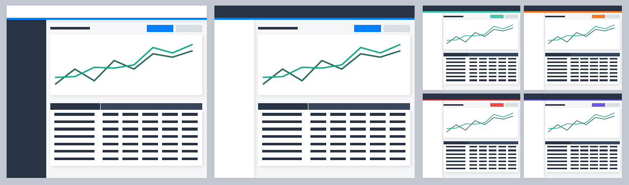
Our primary products use TUNE Blue as an accent, but the neutral palette supported a variety of stronger colors.
GROWING THE LIBRARY
After the base was in place, we started creating simple components that would be easy to get cross team agreement on. I wrote the first spec for buttons as an example. The spec included details of how the components should be built for the engineers and how and when to use each variant for designers.
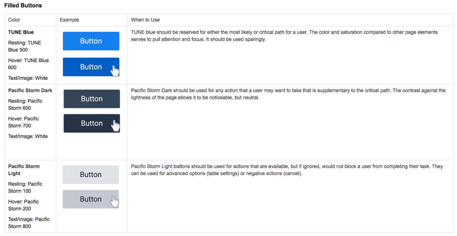
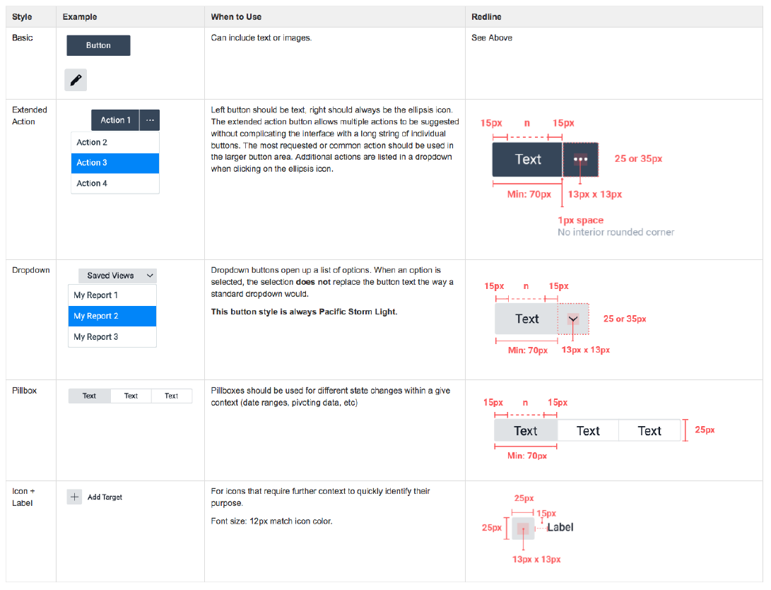
Examples from the button spec
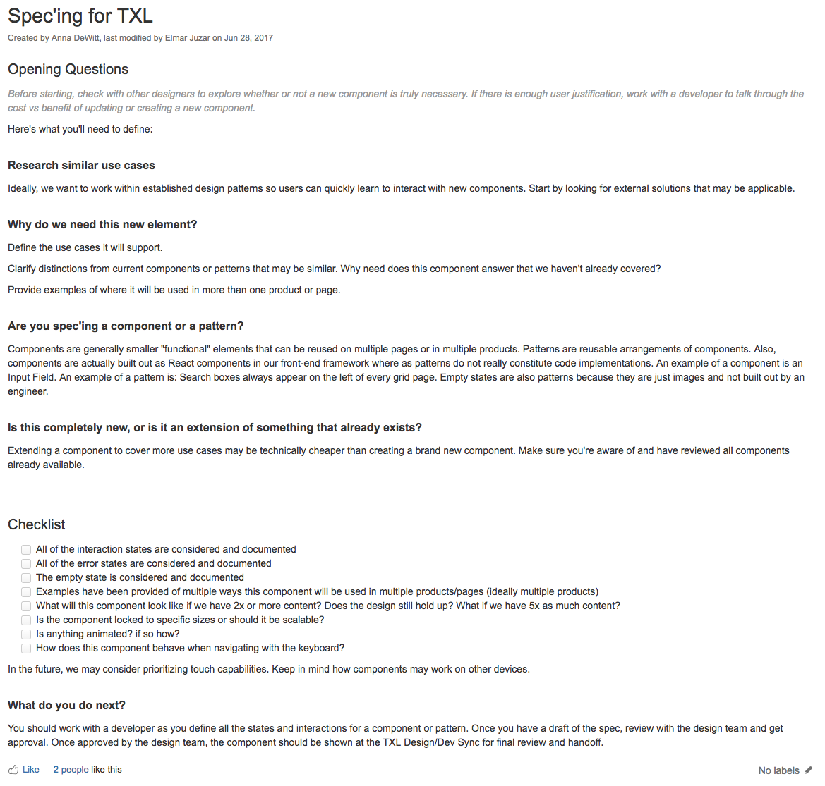
As soon as possible, we opened up design of components to the team. It was important that the TXL was created and maintained by the entire team to increase awareness and give individual designers a sense of ownership. To ensure everyone was on the same page, I wrote a list of requirements for adding components. This kept standards high and decreased the likelyhood of duplicate components.
RESULTS
Three years later, TXL defintes TUNE's products and style. It has become part of TUNE’s core and it’s not unusual to hear employees outside of design and engineering mention it. We have other 38 components, 20 patterns, and it's used across 6 products.

To learn more about recent work, get in touch