Adding Partners
Addressing customer struggle with one of the core workflows of our attribution product.
TUNE, 2018
BUSINESS GOAL
Attribution Analytics solves a market niche of connecting advertisers with partners, or media buyers, with whom they can run campaigns. While you can add any partner you like, we offer integrations with over a thousand partners. These integrations streamline setup and data sharing between the partner and advertiser allowing both parties to make more informed decisions.
PROBLEM
Through our quarterly field studies, where we visit client offices, we saw that several clients that had multiples of the same partners in their added partner lists. When probed about why, clients weren't sure. They noted that it was problematic when trying to select the correct partner and setup campaigns, but had no idea how the partners had multiplied.
RESEARCH
Back in the office, we checked out partner lists across clients and found that many clients were seeing this issue. Nearly 27% of partners added to client accounts we duplicates of our integrated partners.
Checking our product, it was easy to see where the confusion was stemming from. We offer three places to add a partner: the Partner List, Integrated Partner Rankings, and Measurement URL page. Two of these places, the Partner List and Measurement URL page, only allowed customers to add non-integrated partner and those areas also represented the most obvious places to add partners.
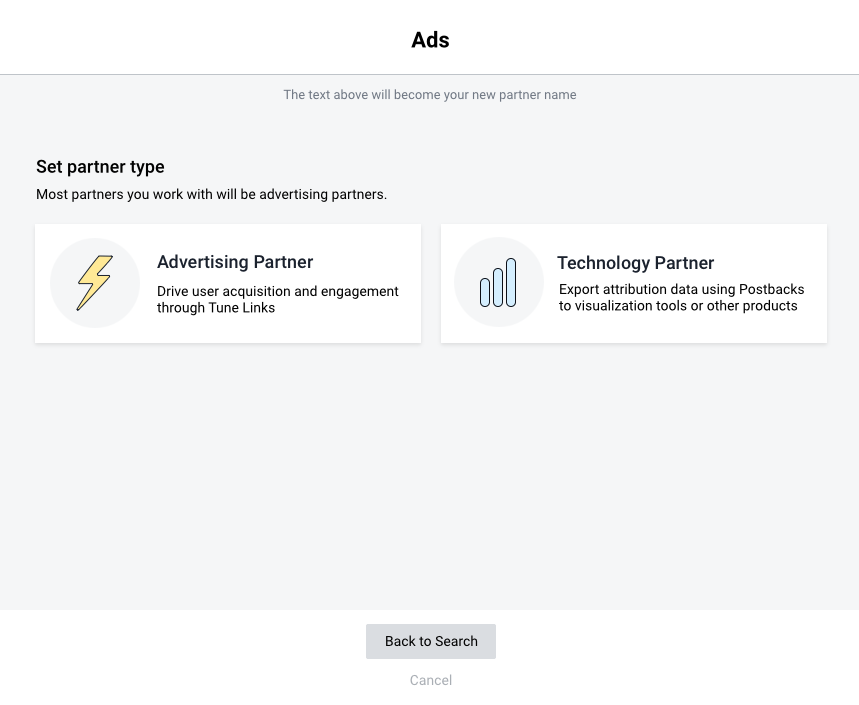
We know from customer behavior that customers most likely want to work with integrated partners. I started planning out designs that would help lead customers toward integrated partners, no matter where they chose to add a partner.
Here's what the original experience looked like:
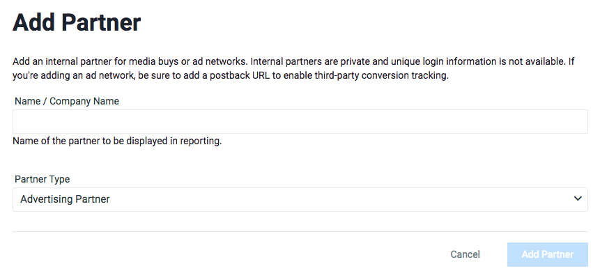
Original Add Partner page launched from the Partner List and Measurement URL only allowed the addition of non-integrated partners.
DESIGN
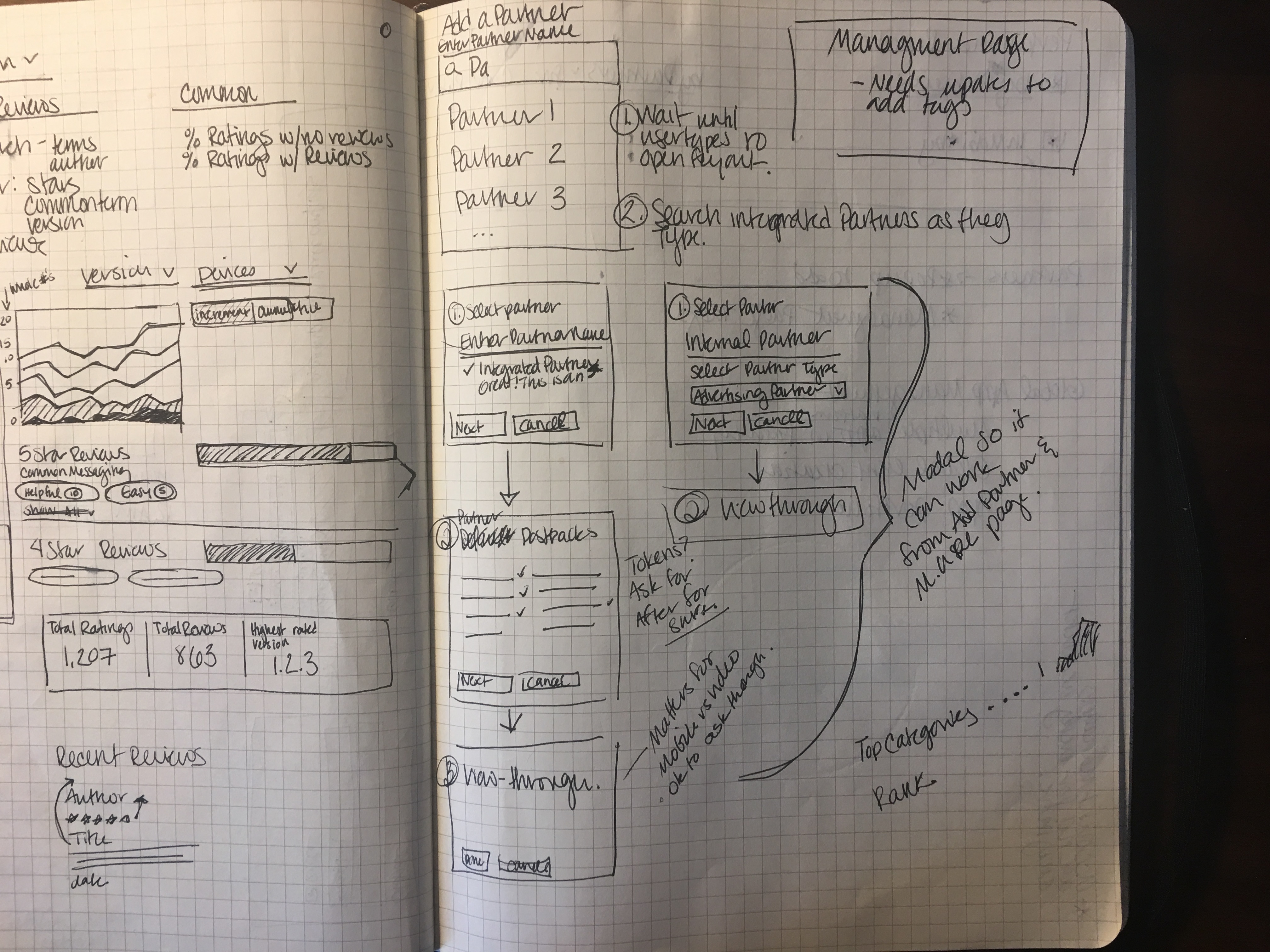
Early on, I determined the Add Partner experience should exist in a modal. The workflow is relatively simple for both integrated and non-integrated partners and when launched from the Measurement URL page, it's an interruption to another longer workflow, so I felt a modal experience would help keep the user in context.
A successful design would also:
- lead users toward adding integrated partners
- prevent duplicate partner names, for both integrated and non-integrated partners
- show users partners that already existed on their account for quick access.
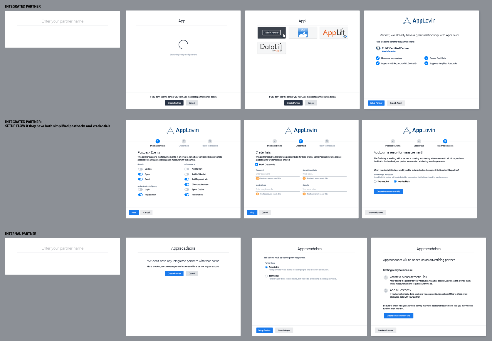
Sketch of the early flow and first iteration mockups. Includes screens to setup integrated partners
My goal with the design was for integrated partners to be suggested first, as the most likely intended partners, but not get in the way of users adding non-integrated partners.
We know most customers have a partner in mind when they decide to setup as there are a lot of out of product negotiations that happen between partners and advertisers before starting a campaign. This meant the usefulness of a browsing experience was low, I designed around a search experience instead.
The search experience that would quickly allow us to look through our integrated partners and suggest matches to users as well as help them add a non-integrated partner if there were no matches.
There are a few additional steps when setting up a partner that we were walking users through after enabling them from the Integrated Partner Ranking page. In the first round of designs, I kept those steps in place.
FINAL DESIGNS
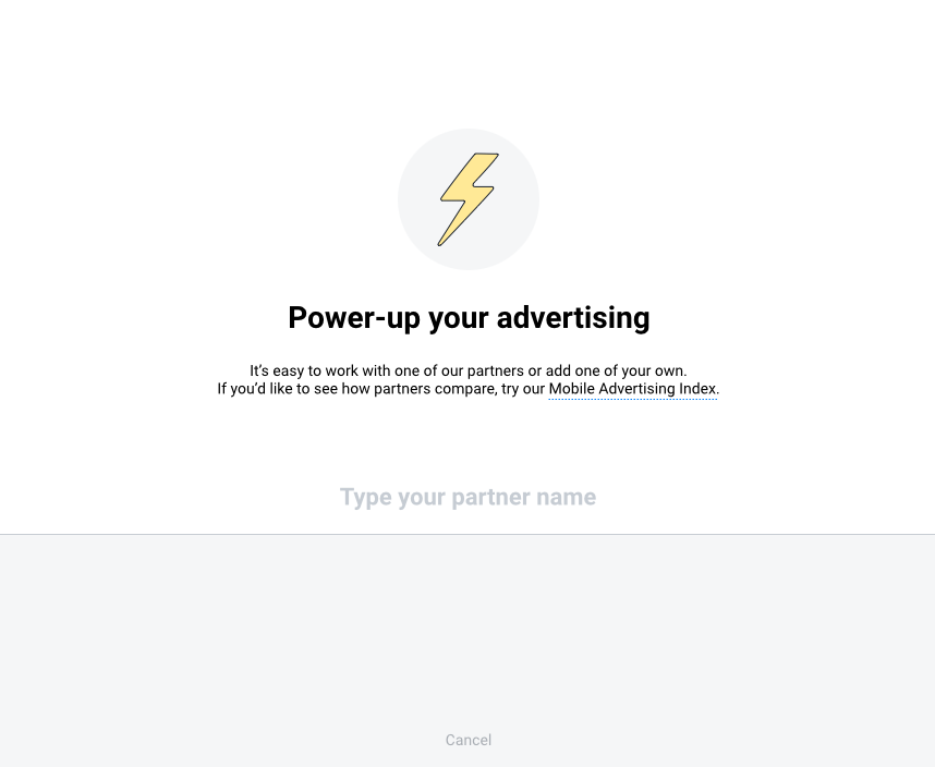
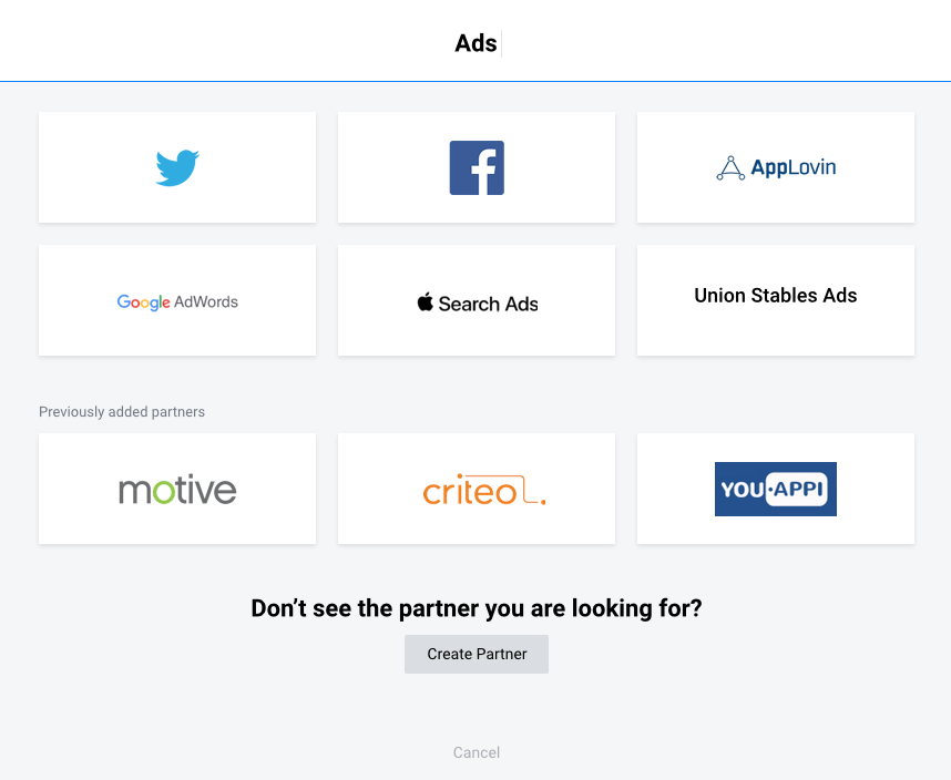
The early designs felt complex with all the extra steps and information tacked on. While those steps were helpful, we wanted the add partner experience to feel light-weight and easy since it's a frequent task for users. We have other options for displaying the secondary tasks, so they were ultimately removed from the modal.
After several more revisions and refinements, I built out a prototype of the experience to show customers. The prototype was made using Principle.

To learn more about recent work, get in touch
