Paid & Organic Data Visualization
Centralized presentation of results for multiple products and audiences
TUNE, 2015
BUSINESS GOAL
In 2014 Tune purchased MobileDevHQ, an app store analytics product specializing in helping users grow organic (not paid) downloads. Coupled with our paid attribution product, the hope was to show both sides of the acquisition coin, and ideally increase paid advertising by demonstrating organic lift.
With two separate products, we had no space to tell the combined story of paid and organic marketing. We needed a feature that could bring the products together.
PROBLEM
The focus of the project was to bring together the two products in a unified space, giving users a cohesive look at user acquisition and then allowing them to launch either product for further analysis and action.
Early on we set a few guidelines on what we wanted to achieve
- Combined campaign results from each product
- Clear data visualizations to drive users into the individual products
- Ability to customize the dashboard to address different company KPIs
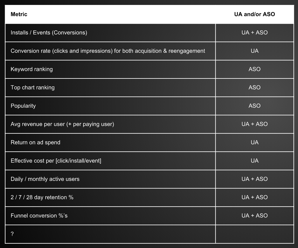
The product team had previously gathered a list of 11 metrics from each product and vetted their usefulness with customers.

Metrics to be shown in the combined space
RESEARCH
To best display these metrics, the product and UX team decided to move forward under the assumption the feature would eventually take the shape of a dashboard. We had access to many examples of dashboard design, including the pros and cons; but no examples of data visualizations that combined the space of paid and organic marketing.
To learn more about presenting this information, we organized a set of customer interviews. The goal was to hear about their existing workflow and what insights they were finding in our data today. We focused on a small set of customers that were using both products and met our criteria of advanced users. I planned and carried out four preliminary interviews with these customers alongside our product team.
These initial interviews gave me the information needed to start putting visualizations together, but first we needed a page structure.
Card sizes for building out the dashboard
DESIGN
Because we wanted a customizable experience for customers, we took a modular approach to building the visualizations. Using a 12 column grid, I came up with 3 card sizes, small, medium, and large. The cards included space for a title and a content area for the visualization. Each data visualization was intended to be built in each of the sizes so users could configure the page according to their unique priorities.
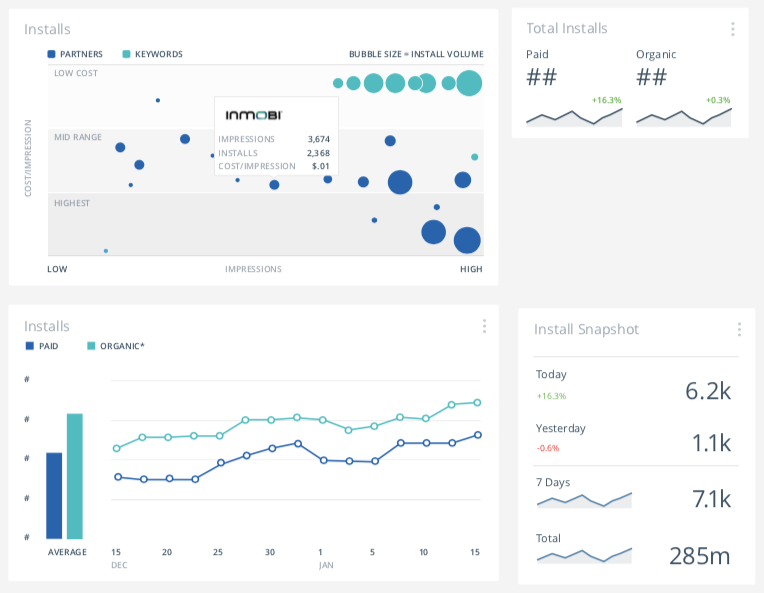
I then started playing with the presentation of data in the cards. I came up with various examples of each metric. We then returned the customers we'd previously interviewed and showed them the examples. These sessions were more like usability tests. We asked participants to interpret each example and talk through their understanding.

Examples of the 'Installs' visualization combining organic and paid sources
FINAL DESIGNS
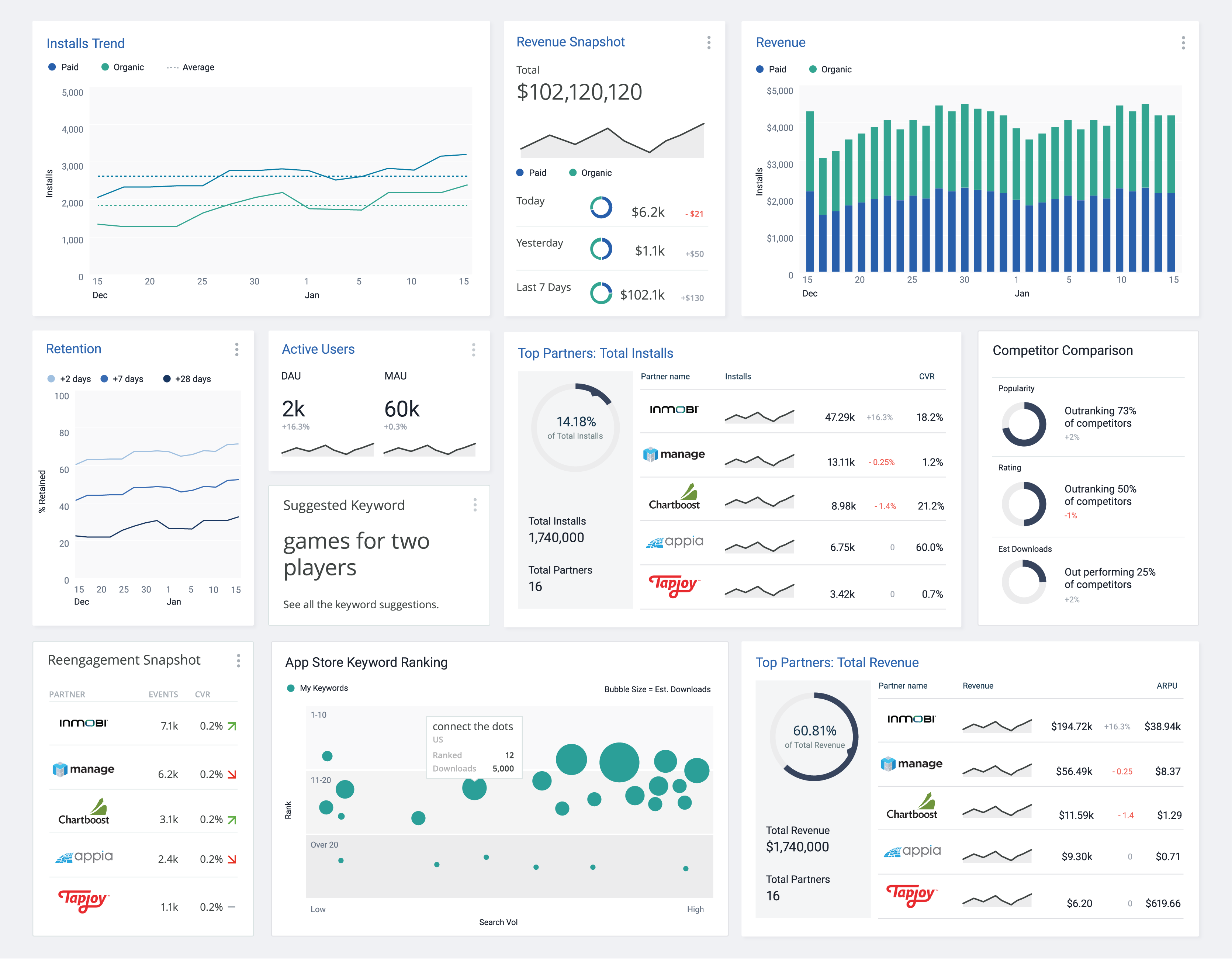
After reviewing the ideas with customers, we landed on 11 cards. Those cards were refined based on the feedback and finalized to hand off to the engineering team.
To decrease the project scope, we only designed one size per metric, but the cards could be added and removed to suit customer's unique reporting requirements.

Final 11 card visualizations

To learn more about recent work, get in touch
