
Avalara
Improving aesthetics and increasing trust for businesses applying for tax exemption
UpTop Agency, 2013
BUSINESS GOAL
Avalara came to us to improve their site's information presentation and organization. The site's purpose was to help businesses fill out tax exemption forms. Customer's were expressing frustration and dropping out of the workflow.
INVESTIGATION
Using analytics tools and surveys, we identified where users were bouncing. We also inverviewed users and found that many users did not understand the purpose of the tool and did not feel comfortable entering sensitive business information.
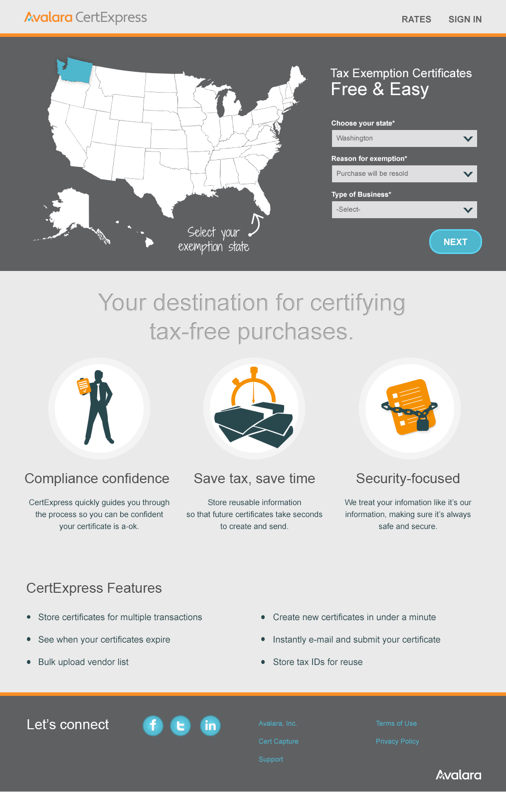
The original site started with a map, requesting the user select their state of exemption. There was no information explaining the purpose of the site, or why users should be interested.
Users were then taken into a modal form, starting with an extensive Terms and Conditions.
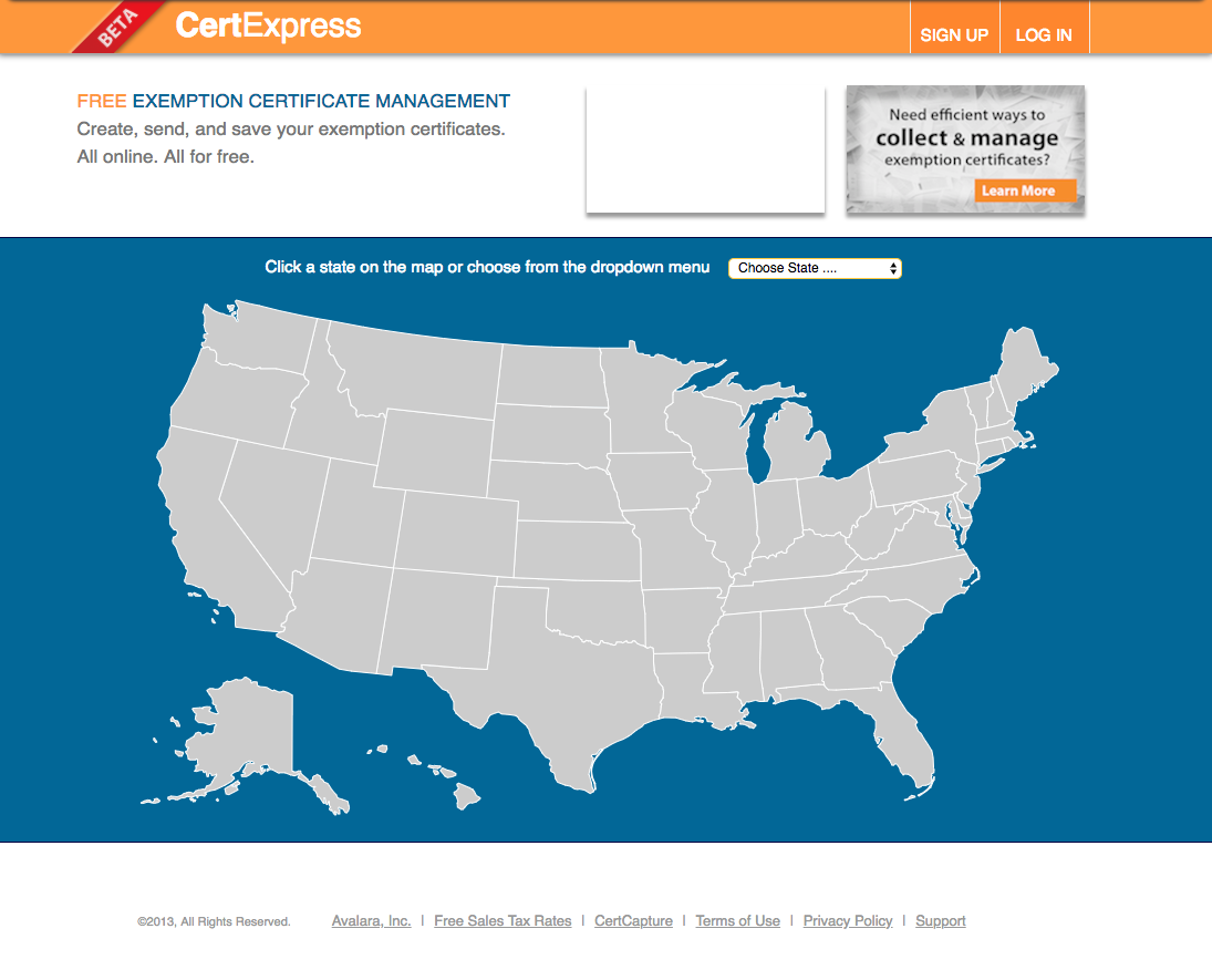
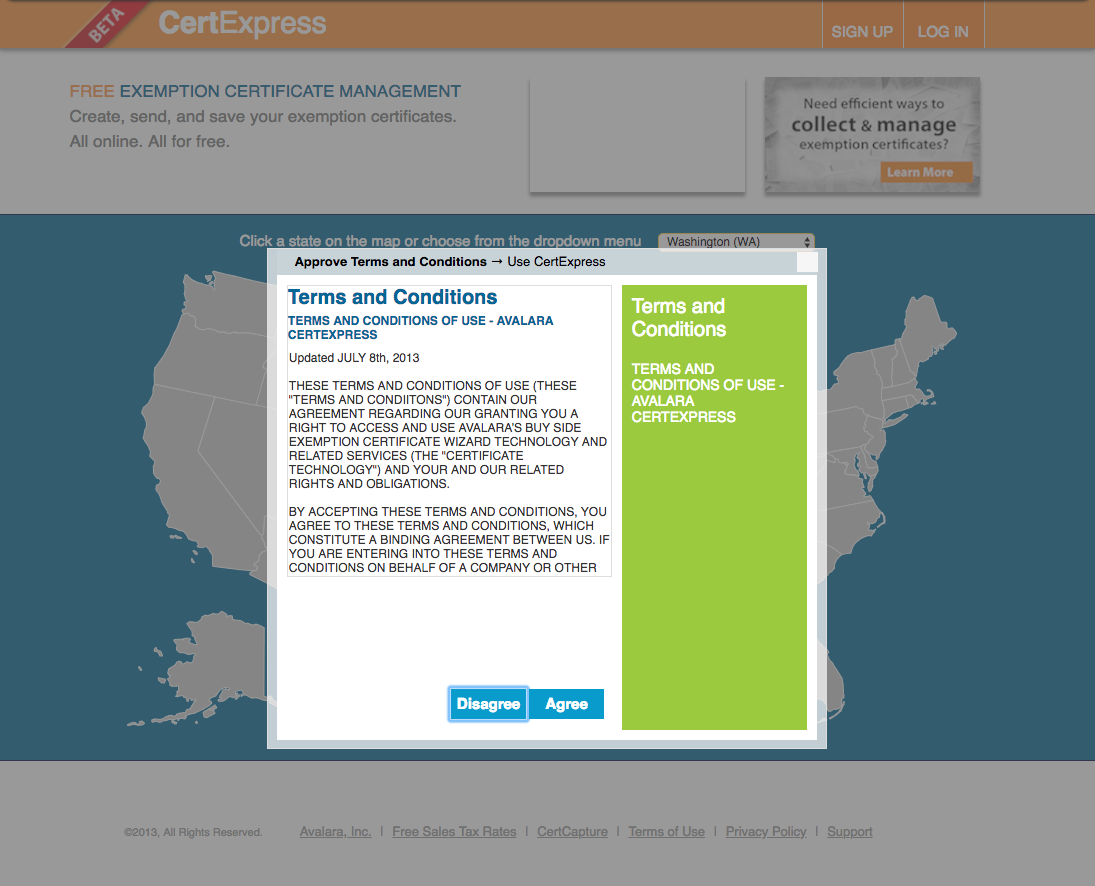
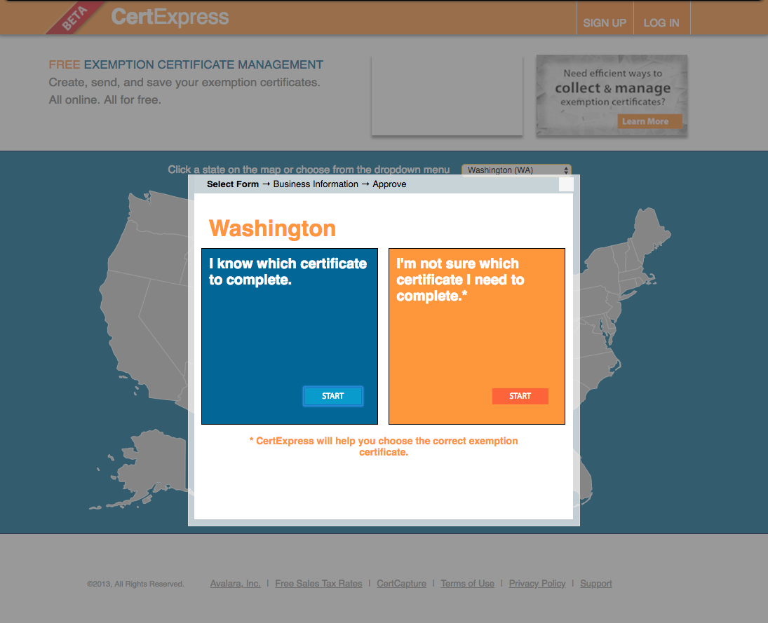
The site at the start of the project
DESIGN WORK
At the time, Avalara was a relatively new brand and the site used an assortment of colors in the color palette. I used the brand orange as a base and played around with a few combinations of supporting colors along with ways to include more value propositions and copy areas to build consumer trust. I also began to expore the presentation of the form using a stepper and longer scrolling page.
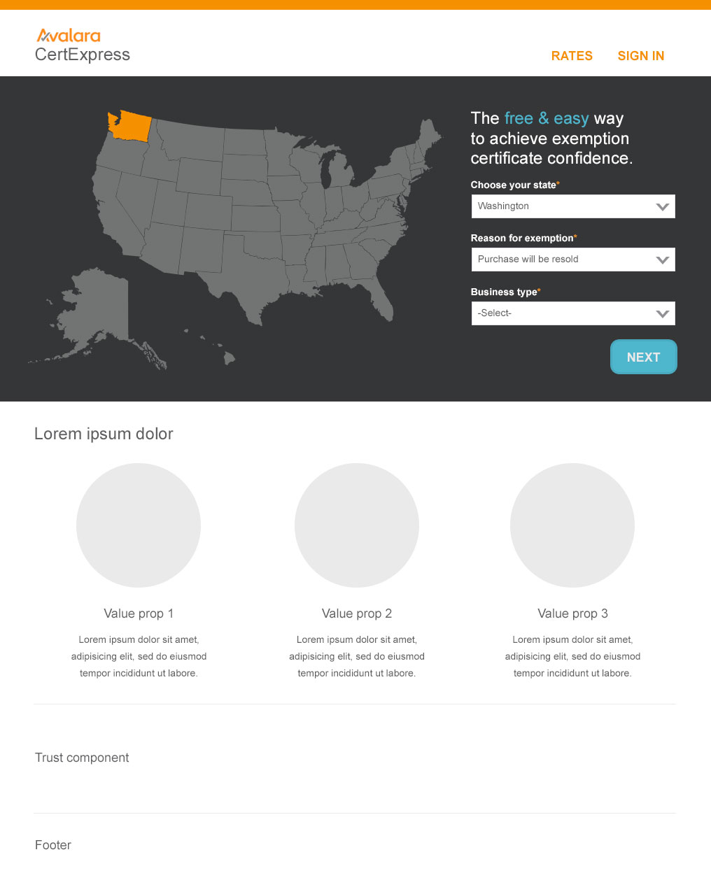
Wireframes for content and color explorations for an updated brand. The first set had a darker, more serious palette
Second set with brighter, playful colors and a long, single page form
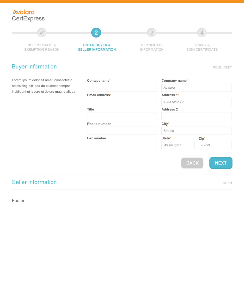
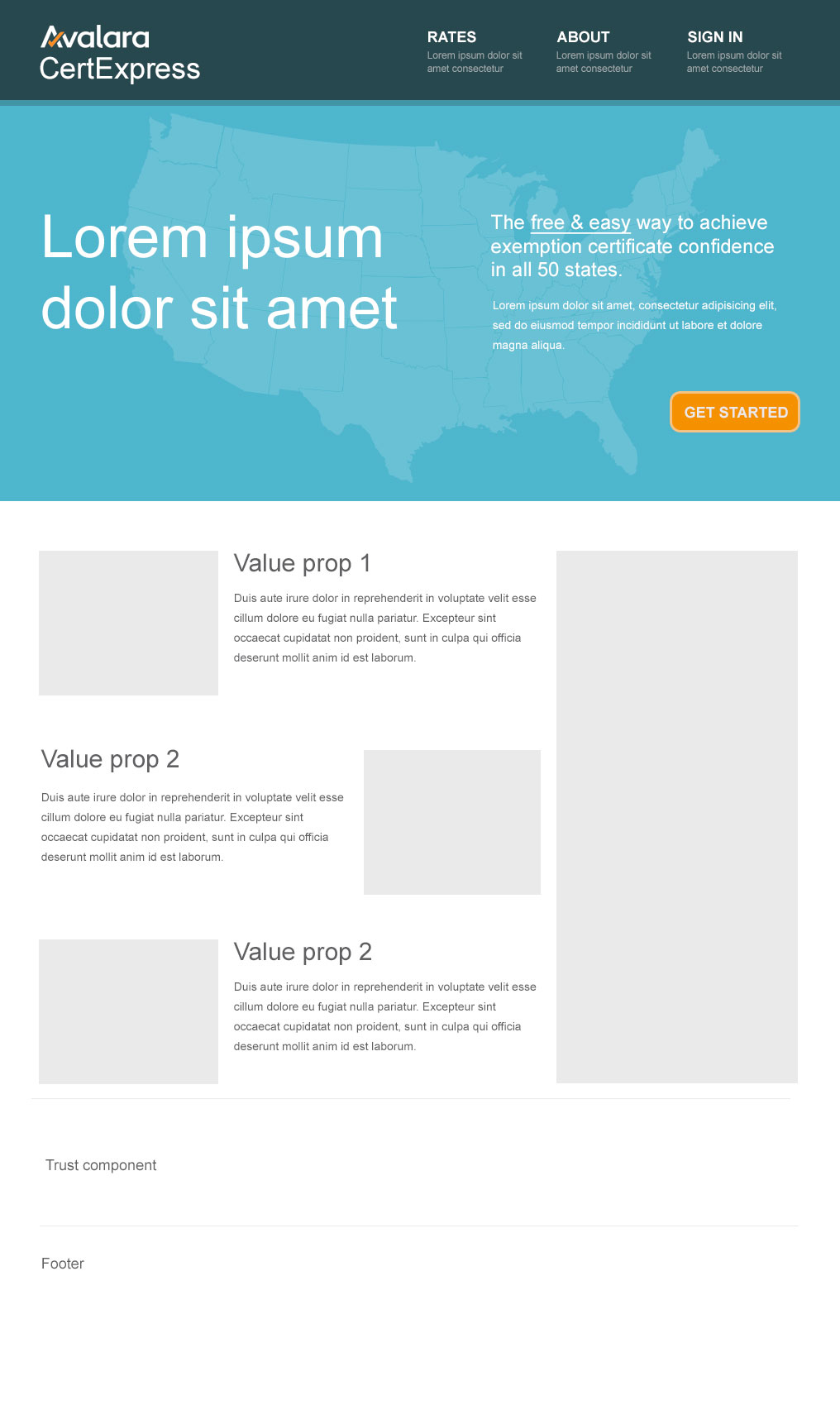
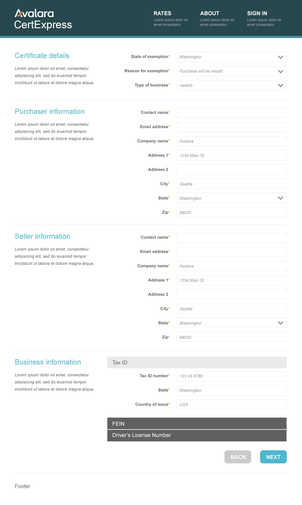
RESULT
After a few iterations, we used the more serious palette and the paginated form. The color palette was based on guidance from the branding team. Weighing the pros and cons of the single vs multiple page form, we went back to the original customer confustion. The multi-page form allowed us to include a lot of helpful information in the context of the page without seeming overwhelming to complete.
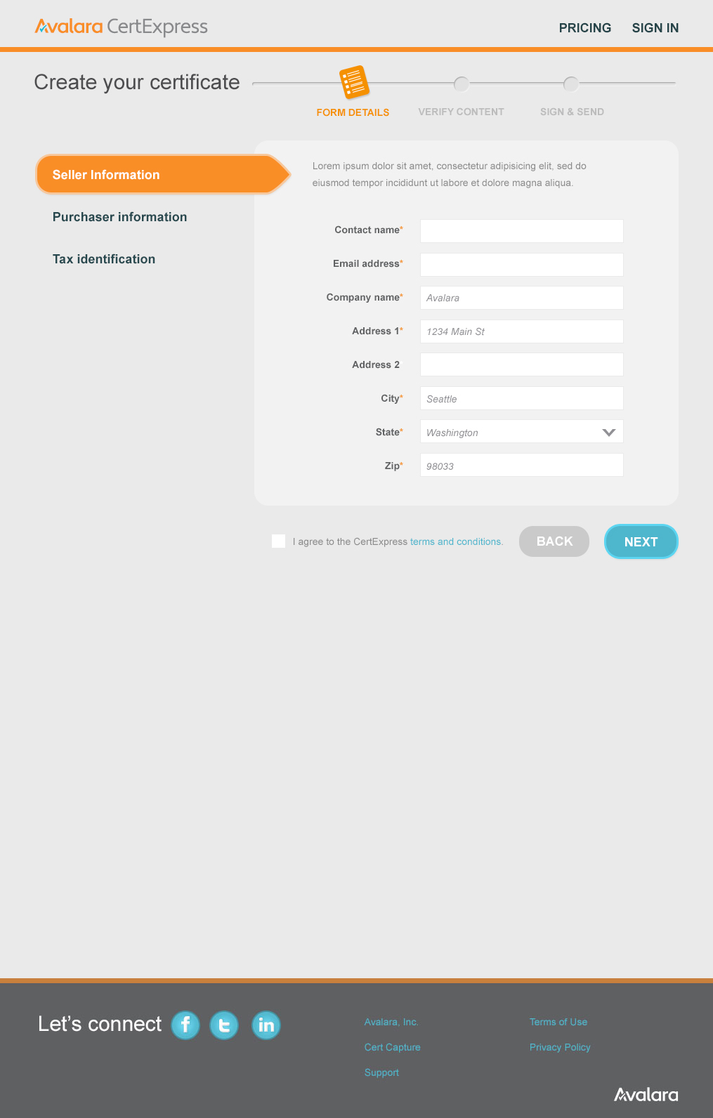
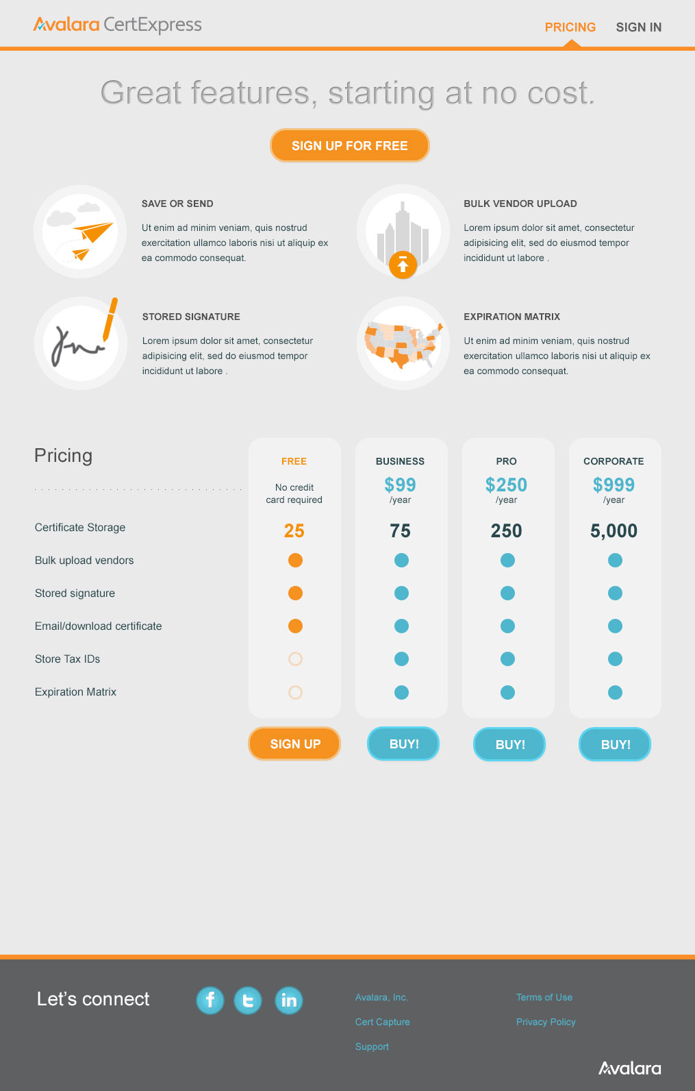
The final mockups included the understated color palette and a pricing page to provide additional context
ILLUSTRATIONS
As a way to increase aesthetics and drive consumer trust, I created a set of illustrations to be used on the home page, form, and pricing page.
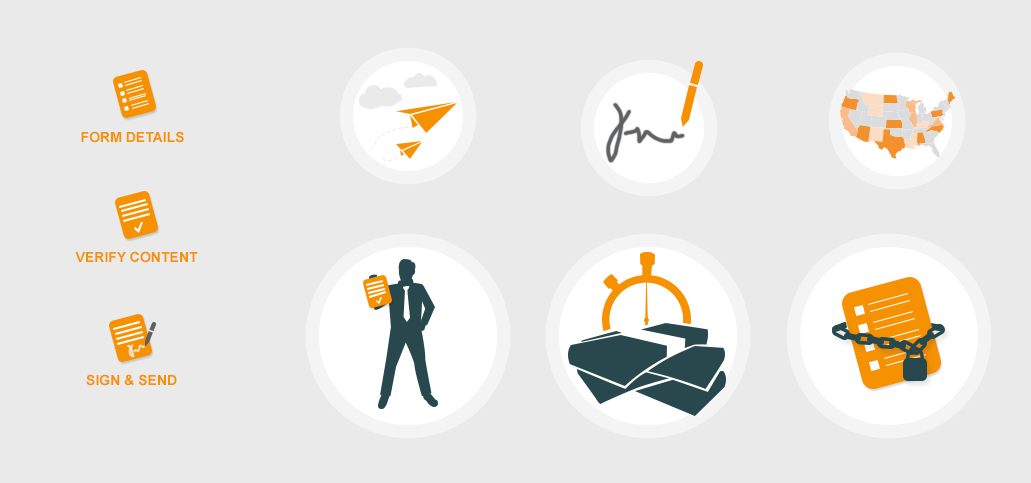
Custom illustrations used in the project
To learn more about recent work, get in touch