
ONBOARDING
Helping users collaborate across areas of expertise and create the right product for their goals.
TUNE, 2017
BUSINESS GOAL
Ease customer reliance on account manages and support teams during product setup.
PROBLEMS
- Three independent products with unique audiences and teams
- Lots of small intricacies requiring knowledge of the advertising space
- Customers uninformed of features offered and how to utilize them
TUNE began in analytics as a single product, Attribution Analytics. We then acquired two other products, In-App Marketing and App Store Analytics. Throughout the acquisitions, we did very little work to help tell a cohesive story across the products. Users that wanted to use any product a-la-cart, were flipped between our different products for basic tasks like adding users, managing their billing and account information, or adding a new app. Product and leadership teams were aware of the fragmented experience, but unwilling to prioritize the work against new features.
To help highlight the onboarding issues and showcase the customer painpoints, I created a customer journey map. The map began from the time a user landed on tune.com and showed a best case scenario of the steps required for that customer to see value from each product. The colored background behind the screenshots coordinates with the different products they hit on their journey to product value.
The journey maps helped get buy in to spend more time on a solution.
Three customer journey maps showing the path a user needed to get to product value in each product
PLANNING
The first step was to map out how the product should work for our customers. The flowchart shows how the personas and the products would work together to create the best experience.
I worked closely with our Account Management, Support and Product teams to come up with the required steps.
Map of the ideal experience between the different product personas and their setup tasks
SOLUTION
While it was helpful to show where the products should head, we needed a solution that could be delivered much faster, customers were struggling to find the information required to be successful at their jobs.
I played around with a few ideas such as notifications and tutorials, but from previous research, we knew that customers dislike any interruption to their primary task. We also knew that flexibility in our product is one of our business strengths and while we wanted to better inform customers of our offerings, not all the information would be pertinent to everyone. The final design needed to help customers when they needed it and be accessible, but not too prominent.
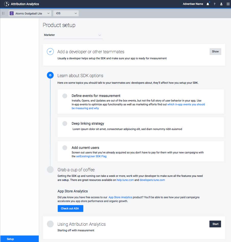
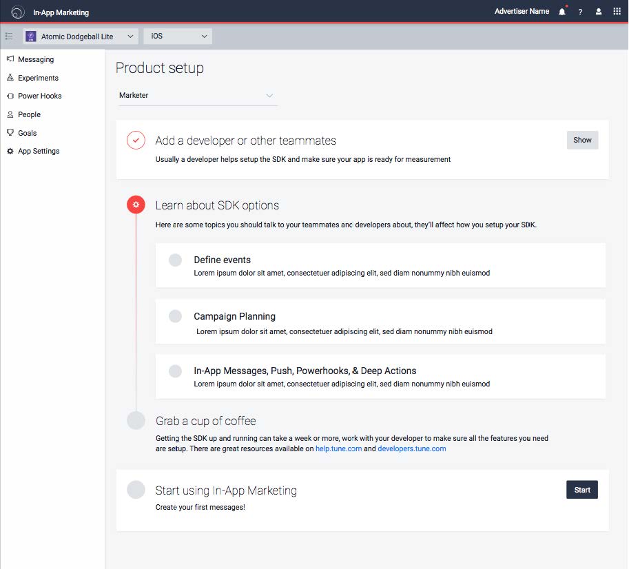
Eventually, I landed on a checklist design where we could consolidate resources and information and link off to relevant areas of the product. The design allowed us to have a centralized space for teaching customers that lived outside of their day to day workflow.
The checklist design gave us the ability to be flexible and scalable to display a range of information. Each product could have it's own checklist tailored to their persona's goals.
PILOT
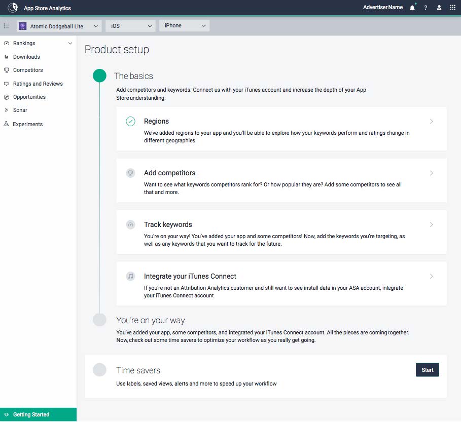
Before developing all three checklists, we piloted with our simplest product: App Store Analytics. This is our least technical product and allowed us to test if customers would find a resource list in the product helpful.
The App Store Analytics checklist focused on user retention. As a free product, a lot of potential customers signed up and tested it out, but around week 3, usage tended to drop off. However, if users added keywords or competitors they were much more likely to find value and continue to use the product.
As part of the checklist design, I placed an entry point in left navigation of the product under "Getting Started". The left navigation is standard in each of our products and the bottom could be reserved for universal placement making accessing the checklist standard across all products.
As a part of the App Store Analytics pilot, we added a call to action across from our app selector and included a badge declaring completeness of setup.
RESULTS
After three months, we found that most people were accessing the checklist via the call to action across from the app selector as opposed to at the bottom of our side nav.
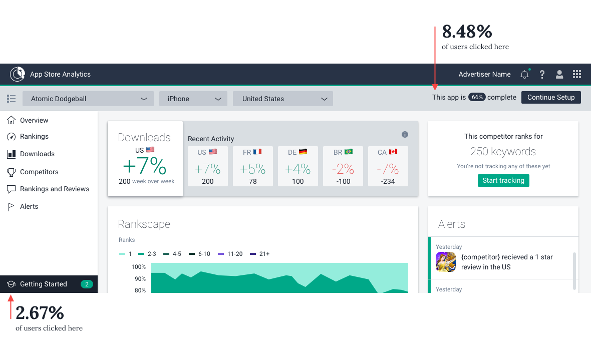
The checklist itself doubled the number of users that were adding a new competitor and keywords. Before release, 7.51% of users had added a new competitor to the product. The checklist increased this number to 15.52%.
The checklist also increased overall customer retention for the product by 6%.
To learn more about recent work, get in touch